How to Ruin a Web Design - The Design Curve
- Subscribe to RSS Feed
- Mark as New
- Mark as Read
- Bookmark
- Subscribe
- Printer Friendly Page
- Report to Moderator
- Plusnet Community
- :
- Plusnet Blogs
- :
- How to Ruin a Web Design - The Design Curve
How to Ruin a Web Design - The Design Curve
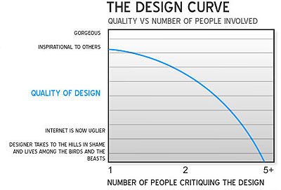
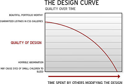
Now this is kind of tongue in cheek, but there is a certain amount of truth within it. I can’t take full responsibility for this article as it actually appeared a couple of months ago on seomoz.org by a gentleman called Matthew Inman. Some of you may of heard of the phrase "A Camel is a horse designed by a committee", this pretty much expands on this theory. A consistent trend that seems to exist within web design at the moment and can be very true for the majority of the web designers is the following. The more time which is spent on analyzing and examining a design by the incorrect people the worse the design gets. This same trend can also be applied to the number of people involved in the design process Matthew then explains: "Group intelligence is multiplicative when idiots are involved - combining a half-wit with another half-wit does not result in a full-witted person, it results in a quarter-witted person (1/2 x 1/2 = 1/4). Combining a full-witted individual with a half-wit still only yields a half-wit. The more of these "wrong kinds of people" you have involved in the process, the worse things get." This can then be represented by the following graphs:


- Those who have never designed anything visual (web, print, or otherwise)
- Those who think 1996 design trends are still hot.
- Managers, executives, etc who have no design experience but like to dictate creative direction simply because they can (or feel obligated to)
- Moderately savvy users who are highly opinionated and feel since they use the web they have an "edge" in the area of design. These clients usually take up the most time yet end up having the worst websites
- Anyone with an eye for great design, no matter what their job title is
- Usability experts who offer advice that has actual experience behind it
- Those who offer constructive criticism. My favorite example of the wrong kind of criticism is when someone says "it doesn't feel right".
- Those that understand that they hired YOU, the designer, to create something great. They may understand their business better, but ultimately they've left their trust with you to deliver a quality design.
